Introduction
The Novel Coronavirus (COVID-19) emerged in the city of Wuhan, China. It has been declared a global pandemic by the World Health Organization (WHO). There has been many charts, infographics, dashboards and reports on the web showing the numbers of confirmed and recovered cases as well as deaths around the world.
I thought, “How could I build my own report/dashboard in Power BI”?
In this blog post I will show you how to use Power BI and build a COVID-19 report in Power BI!
Dataset
Well, that would first require me to find the dataset. Luckily the Johns Hopkins University Center for Systems Science and Engineering (JHU CSSE), supported by ESRI Living Atlas Team and the Johns Hopkins University Applied Physics Lab (JHU APL), has a GitHub Repository with curated daily datasets by Country/Region and Province/State for confirmed cases, recovered cases and deaths. The dataset is updated daily with the latest data.
JHU CSSE GitHub Repo/Folder with COVID-19 Data in Time Series Format – https://github.com/CSSEGISandData/COVID-19/tree/master/csse_covid_19_data/csse_covid_19_time_series
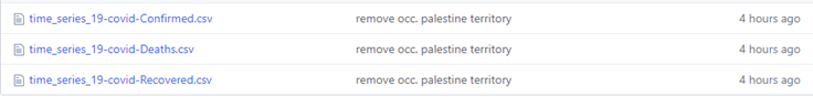
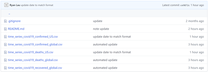
In the GitHub folder you will find three CSV (Comma Separated Values) files (see image below); one for Confirmed Cases, one for Recovered Cases and one for Deaths.
If you click on one of the files you will see the data. Also, you will see a button called “Raw”. If you click the “Raw” button you will get the URL you will need to import that dataset into Power BI.

URLs for the 3 files:
Confirmed Cases – https://raw.githubusercontent.com/CSSEGISandData/COVID-19/master/csse_covid_19_data/csse_covid_19_time_series/time_series_19-covid-Confirmed.csv
Recovered Cases – https://raw.githubusercontent.com/CSSEGISandData/COVID-19/master/csse_covid_19_data/csse_covid_19_time_series/time_series_19-covid-Recovered.csv
Deaths – https://raw.githubusercontent.com/CSSEGISandData/COVID-19/master/csse_covid_19_data/csse_covid_19_time_series/time_series_19-covid-Deaths.csv
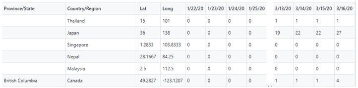
Each file has the data reported with the Province/State, Country/Region, Lat and Long (Province/State) and pivoted column with cumulative/running totals (notice the values increase by day) of cases/deaths for each day since reporting has started. We will import these three files into Power BI and wrangle the data into a format useful for reporting in Power BI.
Power BI Desktop
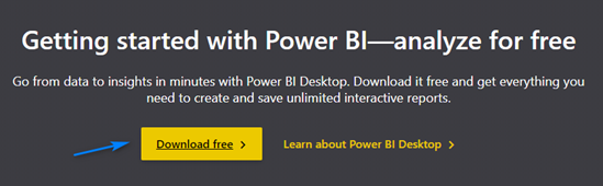
Now that we know where to get the data, we need to get the right tool to report on the data, Power BI! You can go to https://powerbi.microsoft.com/en-us/ and click the “Start free >” button to get Power BI Desktop (it’s free!) and start building amazing reports.

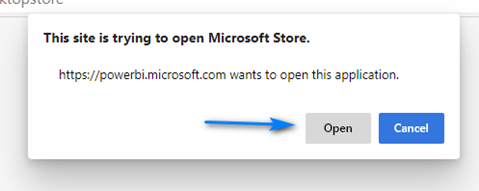
Then click “Download free >” on the next page to launch Microsoft Store to install the Power BI Desktop application
When the prompt appears notifying about opening the Microsoft Store click the “Open” button.
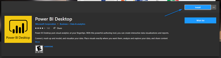
In the Microsoft Store click “Install” to install on the Power BI Desktop screen to install Power BI Desktop.
Power BI – Get and Transform Data with Power Query
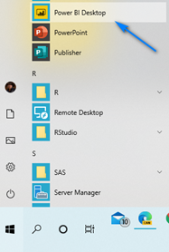
After Power BI installs in the Start Menu find “Power BI Desktop” launch Power BI. When prompted sign-up for a free account.
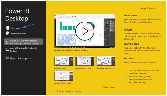
After you sign-up on the splash screen click “Get Data”. We will start with import the Confirmed Cases file into Power BI.
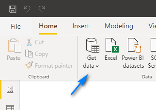
NOTE: If the splash screen is not longer there and you are in the Power BI Desktop App
OR …
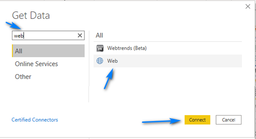
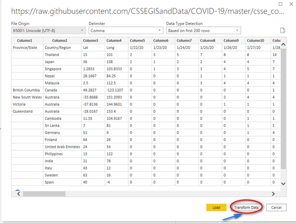
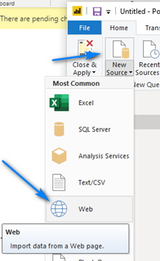
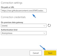
In the Get Data dialog box type “web” in the search box at the top left, select “Web” and then click “Connect”.
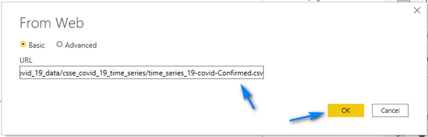
In the “From Web” dialog paste in the URL (https://raw.githubusercontent.com/CSSEGISandData/COVID-19/master/csse_covid_19_data/csse_covid_19_time_series/time_series_19-covid-Confirmed.csv) for the Confirmed Cases into the URL box and click “OK”.
In the next screen click “Transform Data” to open Power Query so we can wrangle some data!
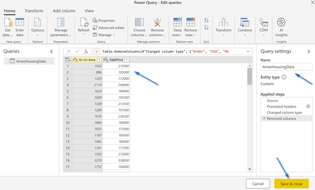
The next screen to pop-up is the Power Query Editor. Yes, like the one in Excel (a little better but mostly the same)! Here we can use the language M to transform and load our data into Power BI Desktop. We will do some steps to get the data in the format we want to report in Power BI.
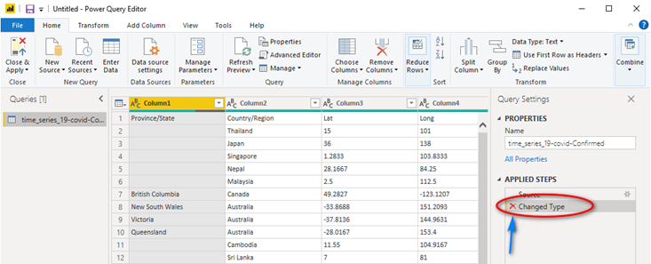
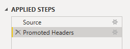
If you look to the far right, you will see a section called “Applied Steps”. You can see Power BI has done two steps, “Source” and “Changed Type”. We are going to remove the “Changed Type” step it automatically added on the import of the CSV file. Click the “Red X” next to “Changed Type” to remove this step.
Now, we will promote the first row of the CSV file to be our column names. If you look at the first row of the data in Power Query you will see the column names. To promote the first row to be Headers of the table click the “Transform” menu, then click the “Use First Row as Headers” button in the ribbon. This will add two steps in the “Applied Steps” section: Promoted Headers and Changed Type.
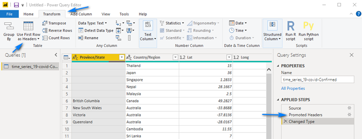
When we promoted the headers Power Query automatically added a step to detect the data types. Click the “Red X” next to Changed Type to remove this step. We will do this later after we unpivot the data.
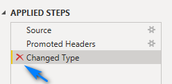
Should look like below now.
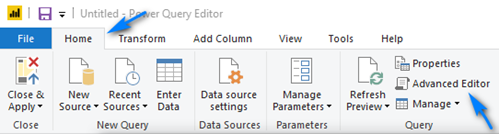
Now we are going to edit the raw M code to remove an option that Power Query put in the Source step (first one) so that as data is added (new columns) each day to the dataset we will pick up the new columns. To do this, in the “Home” menu click the “Advanced Editor” button.
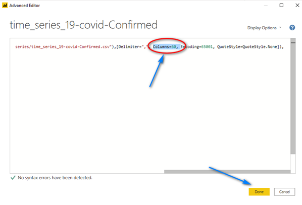
In the “Advanced Editor” window scroll to the right and in the “Source = Csv.Document …” line remove the “Columns=XX,” part in the line (XX will be a number representing the number of columns in the file, in my example below it was 60) and click “Done”. We want to remove the hard-coded column count because as new data points are added as columns to the file each day, we will want to pick up those columns. If we leave the hard-coded “Columns=XX” we will not pick up these new days/columns.
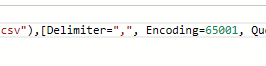
Should look like this below between “Delimiter” and “Encoding” after you remove the section (be sure to get the comma). When you click “Done” you will not notice any changes.
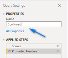
Let’s rename the table to Confirmed. To do this, in the Name box to the right change time_series_19-covid-Confirmed to Confirmed.
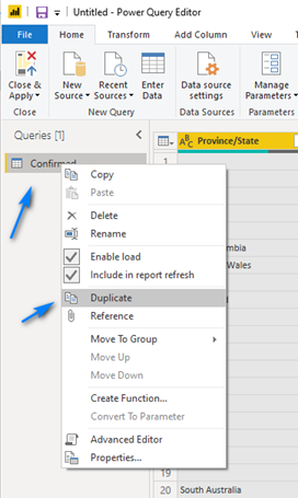
Next, we need to duplicate the table before we perform other steps so that we can create a dimension table to use later for better data modeling and report building in Power BI. To do this, right-click on the Confirmed query on the left and choose Duplicate.
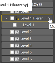
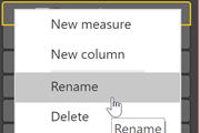
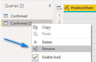
Right click on the new Query it created called Confirmed (2) and choose Rename and name the query Header.
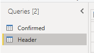
Should look like this.
Let’ cleanup our Header query to be our dimension.
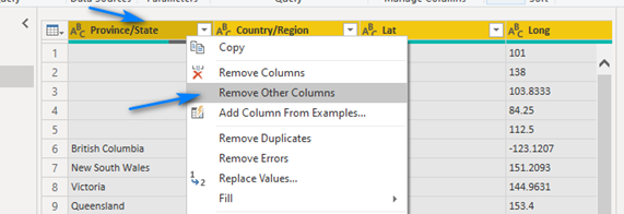
Hold down the shift key and select the four columns in Header called: Province/State, Country/Region, Lat and Long. You should see the column headers for the four columns become yellow. Right-click on one of the four columns and choose Remove Other Columns. With the same four columns selected, right-click again and choose Remove Dupliates.
We are good with the Header table/query now.
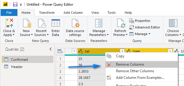
Let’s go back to editing our Confirmed query/table. We can now remove the Lat and Long columns of our Confirmed table as we will use them from the new Header table we created. To do this, hold down the shift key and select the Lat and Long columns in the Confirmed table and right-click and choose Remove Columns.
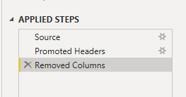
Our Applied Steps should now look like this.
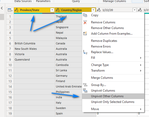
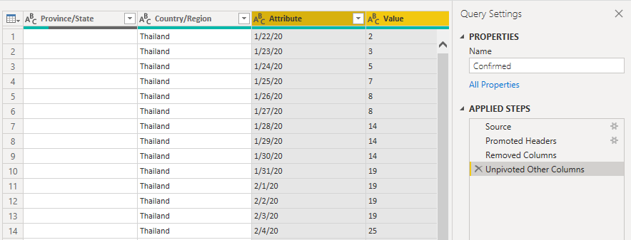
Now comes the fun part, the part that Power Query in Power BI is amazing at doing – Un-pivoting data! We are going to un-pivot on the Province/State and Country/Region columns to get the daily data columns to go from being a column per day to a row per day with a column for the date and a column for the value. To do this we hold down the shift key and select the Province/State and Country/Region columns and then right-click on one of the two columns, Province/State or Country/Region, you selected and choose Unpivot Other Columns.
Now look at our Confirmed table and steps! We now have the data in a better format for reporting … but we have a few more things to do.
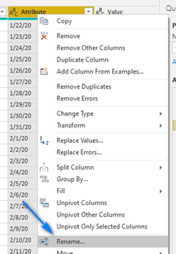
So, let’s rename our new Attribute column Date. Right-click on Attribute column and click Rename… and rename the column Date.
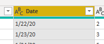
Looks like this now.
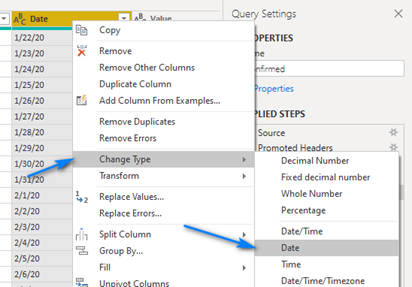
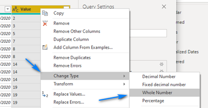
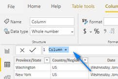
Now finally let’s change the datatypes of the Date and Value columns to Date and Whole Number, respectively. Right-click on the Date column and click Change Type ->
Date. Right-click on the Value column and click Change Type -> Whole Number.
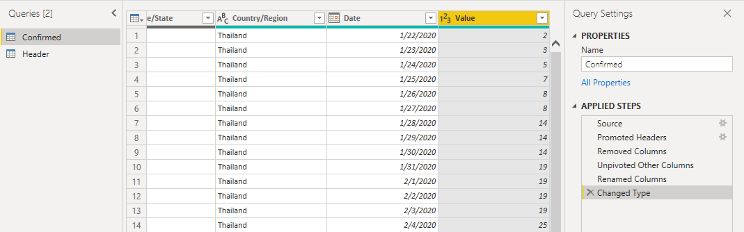
Our table should look like now!
Repeat these steps in Power Query (MINUS the steps to create the Header table!!) for the other two files – Recovered Cases and Deaths. Call the tables/queries Recovered and Deaths and be sure to use the correct URLs for each table.
To bring in the two new files you can click New Source -> Web at the top and follow the steps above (MINUS the steps to create the Header table!!).
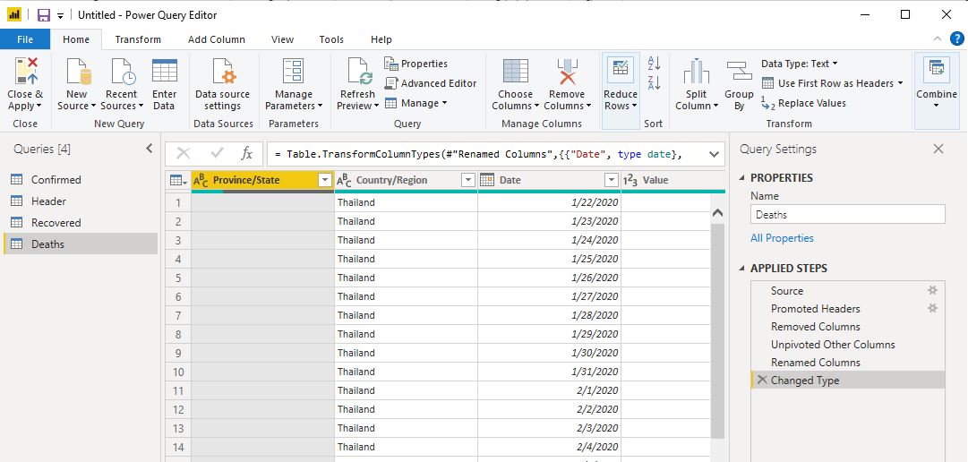
Once done it should look like this!
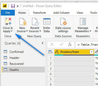
Now let’s Close & Apply our work and get into the Power BI Desktop. Click the Close & Apply button at the top left to close Power Query and return to the Power BI Desktop.
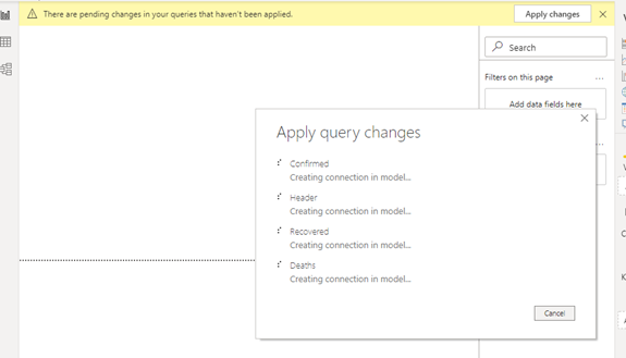
You will see it bringing the tables into Power BI Desktop.
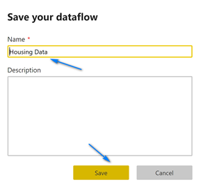
Click the Save button at the top left and save your work so far! You can call the file Power BI Coronavirus Report.
NOTE: Name your Power BI Report files carefully, i.e., give them names that our friendly as they become the Report name in the Power BI Service when you publish.
Power BI Desktop – DAX Data Wrangling
We now have our data in Power BI Desktop to build report but before we build a report we need to create a few more tables using DAX. DAX is the Data Analysis Expressions language used in Power BI to create calculated columns, measures and tables.
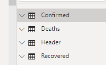
We need to add a few columns as keys in our table, hide a few columns from the reports and add a date table. Click the Data button at the top left side to start using DAX to transform data using DAX in Power BI Desktop. Notice our four tables we created in Power Query on the right.
 … … … … … … … … …
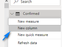
We are going to add a column called CountryState that will be combination of the Province/State and Country/Region columns. This will be a key for our tables to the Header table. To add the column/key right-click on the table and click New column.
In the dialog at top enter the formulas below for each table, respectively, to create the key.
Should look like this for the Confirmed table. Click the Checkmark to apply and create the column.

Repeat for each table using the following DAX formulas:
Confirmed: CountryState = COMBINEVALUES("|", 'Confirmed'[Country/Region], 'Confirmed'[Province/State])
Deaths: CountryState = COMBINEVALUES("|", 'Deaths'[Country/Region], 'Deaths'[Province/State])
Header: CountryState = COMBINEVALUES("|", 'Header'[Country/Region], 'Header'[Province/State])
Recovered: CountryState = COMBINEVALUES("|", 'Recovered'[Country/Region], 'Recovered'[Province/State])
We can now hide these four keys from each table as we do not need them in the reports themselves but just to create the relationships between the 3 data tables and the header table.
In each table right-click on the CountryState column we just created and choose Hide in report view. Repeat for each table.
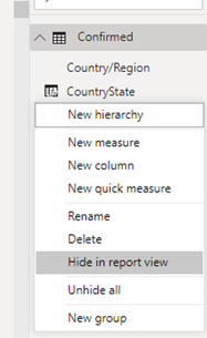
You will now see that the CountryState column is greyed-out now.
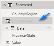
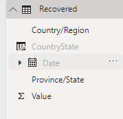
Repeat (Hide) for the Date columns in the 3 data table, Confirmed, Deaths and Recovered.
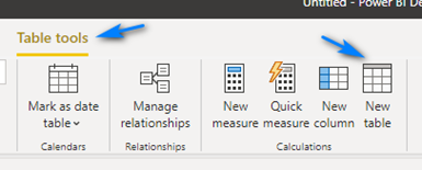
Now we will use DAX to create a date/calendar table to use as our Date dimension table. To do this click the Table tools menu and then click the New table button.
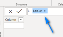
In the formula bar enter the DAX code below from Adam Saxton to create a Calendar table to use as a Date Table dimension.
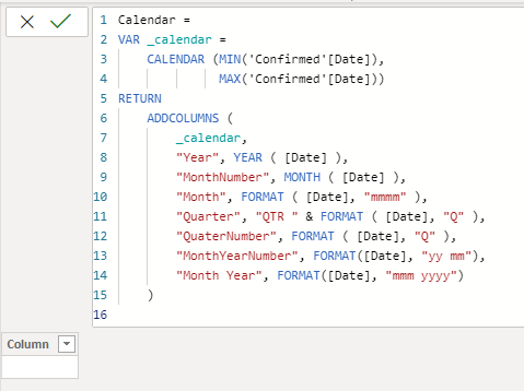
DAX for Date Table (from Adam Saxton, Twitter: @awsaxton, Web: https://guyinacube.com/)
Calendar =
VAR _calendar =
CALENDAR (MIN(‘Confirmed'[Date]),
MAX(‘Confirmed'[Date]))
RETURN
ADDCOLUMNS (
_calendar,
“Year”, YEAR ( [Date] ),
“MonthNumber”, MONTH ( [Date] ),
“Month”, FORMAT ( [Date], “mmmm” ),
“Quarter”, “QTR ” & FORMAT ( [Date], “Q” ),
“QuaterNumber”, FORMAT ( [Date], “Q” ),
“MonthYearNumber”, FORMAT([Date], “yy mm”),
“Month Year”, FORMAT([Date], “mmm yyyy”)
)
Should look like this for the Calendar table. Click the Checkmark to apply and create the table.
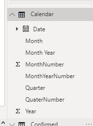
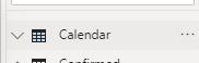
We now have a Calendar table!
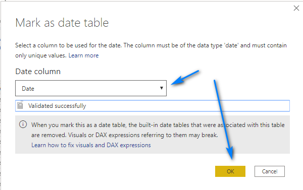
Finally, we need to mark the Calendar table as a “date table”. Select the Calendar table in the right. Then in the Table tools menu select the Mark as date table.
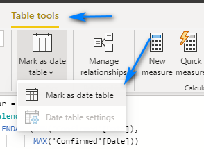
Then in the pop-up window select the Date column for the Date column drop-down and click Ok.
Power BI Desktop – Modeling
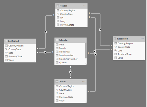
Now we need to setup the relationships for our tables. To do this we use the Model section of Power BI Desktop. Click the Model button at the top left side to start modeling our table relationships.
Our tables will show up in a dark grey area where we can drag the table around to re-arrange them and create relationships. Drag the Header and Calendar tables into the center and place the Confirmed, Deaths and Recovered tables around them like below. NOTE: You will have to scroll around a little to move and re-arrange them as so.
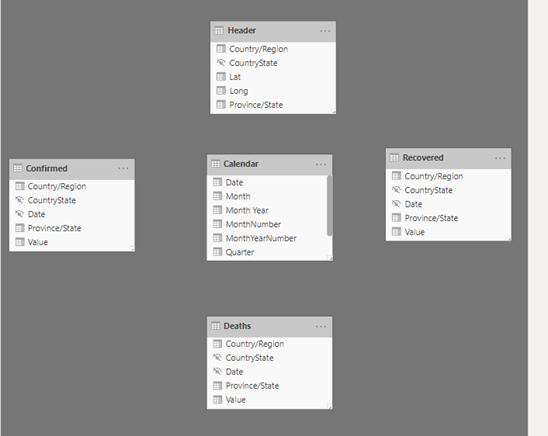
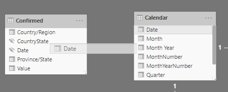
Now that we have them arranged we can build the relationships. To do this we will use are keys, Date and CountryState, and drag from Calendar the Date field to the Date field in the 3 data tables Confirmed, Deaths and Recovered. We will repeat for the CountryState column in the Header table to the 3 data tables Confirmed, Deaths and Recovered. Below is an example of how to drag the columns.
When done are model should look like below.
Let’s click the Save button to save our work again!
Power BI Desktop – Reports
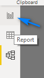
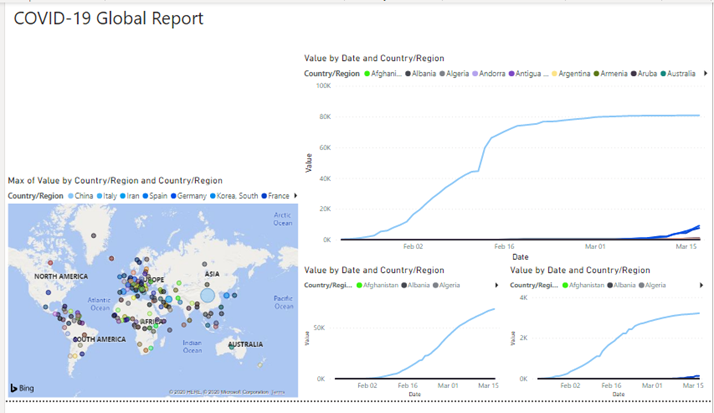
Now we are ready to build a report. Click the Report button at the top left side to start building our report!
In the Report window let’s first setup our Theme. Click the View menu at top and then you will see all the available pre-built themes you can choose from (like PowerPoint!). Click the light grey arrow to the right and then click the Storm theme (see below).

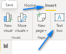
Now let’s add a title to our report. Click the Insert menu and then click Text box.
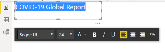
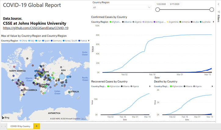
Position it as below and give it a title, COVID-19 Global Report, and set the font to 24.
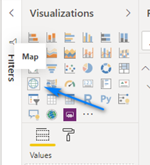
Next, add a map to the report so we can show the occurrences of coronavirus by country. Click the Map visual icon in the Visualizations pane to add it to the report (make sure nothing is selected on the report before clicking the Map visual).
Position it at the bottom left.
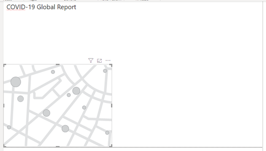
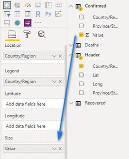
Drag the Country/Region column in the Header table to the Location box and the Legend box in the Fields area.
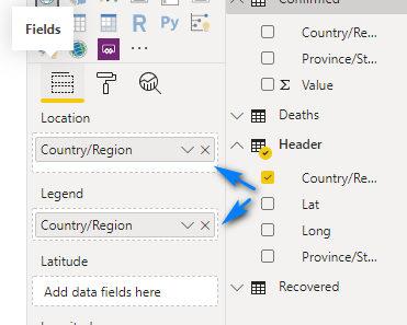
Add the Value column from the Confirmed table to the Size box.
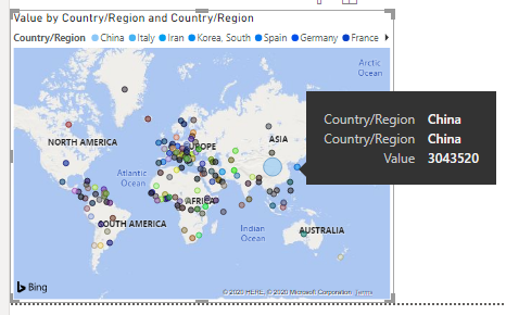
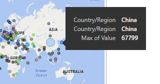
You map should look like this. There is one problem though! Since our data is values with running totals (see data section above) we get incorrect counts for the number of confirmed cases. Notice when we hover over China it shows China has over 3 million cases which is not correct. The reason is because the default aggregation method in Power BI is SUM.
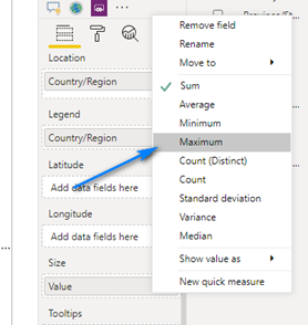
To fix this we need to change the aggregation method for the Value column in the Size field to be Maximum. To do this we click the little down arrow to the right of Value in the Size field.
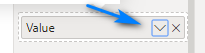
Then we choose Maximum.
Now when we hover over China, we get the correct value.
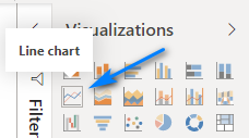
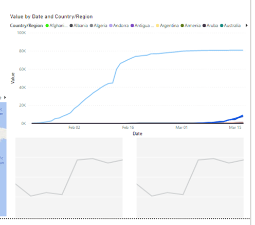
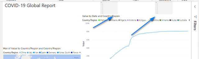
OK, now we will add a line chart to show the spread of the coronavirus by country by day. Make sure none of the items in the report are selected and choose the Line Chart visualization.
Position it as show below. Notice the read guide/snap lines that show up to help align it.
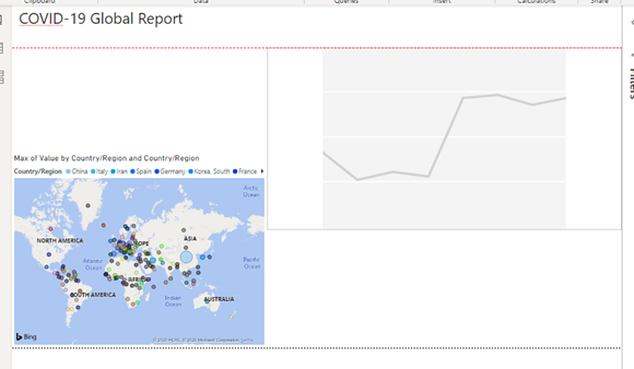
Drag the Date field from the Calendar table to Axis. Drag the Country/Region field form the Header table to Legend and drag the Value field from the Confirmed table to Values.
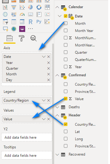
Notice the Date field automatically has a date hierarchy created and used in the visual.
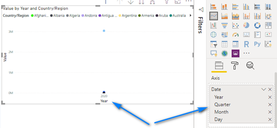
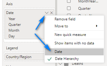
In this instance we do NOT want a data hierarchy. So, to remove it, click the grey down arrow next to Date in the Axis field and choose Date.
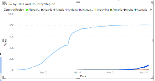
Bazinga! We have a nice line graph showing the spread of the virus by country!
Now add two more Line Charts below this one and position as below.
In the left one add the same fields as the top Line Chart but replace the Values field for the Value field in Recovered.
In the right one add the same fields as the top Line Chart but replace the Values field for the Value field in Deaths.
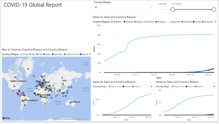
Your report should look like this below now.
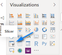
Now add some Slicers to the report to slice and dice the data by country or data. Make sure nothing is selected and click the Slicer visualization twice to add to Slicers to the report.
Position the slicers as such.
Select the left Slicer and drag the Country/Region field into the Field box.
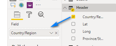
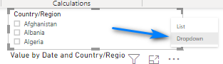
Your Slicer will now be populated with the countries and regions. Let’s change this to be a dropdown. In the top right of the Slicer hover your mouse and click the very little light grey down arrow.
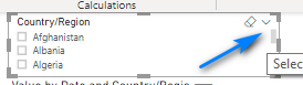
In the menu that displays select Dropdown.
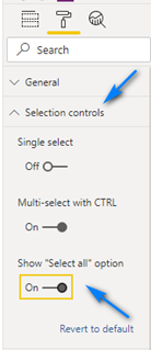
Now in the Format section (the Paint Roller icon!) of the Slicer let’s change a few options.
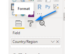
In the Selection controls section let’s enable Show “Select all” option so we can make it easier to select countries in our slicer.
Now on select the right slicer and let’s setup a Date slicer. Drag the Date field from Calendar into the Field box.
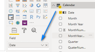
You now have a date slicer to play with the dates in your report. Slide the date slider around and see what happens!
Finally, let’s add another Text box to show credit for the data source. Click the Insert menu and then click Text box and position below the title and add the following text and format as desired.
Data Source:
CSSE at Johns Hopkins University
https://github.com/CSSEGISandData/COVID-19
You can use the Paint Roller icon on the visuals to change colors, titles, etc.!
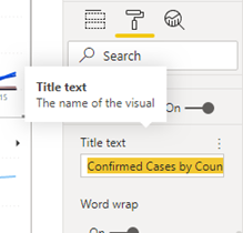
For example, lets change the Title text of the Line chart for Confirmed cases. Select the top Line chart. Then select the Format (Paint Roller)
icon and scroll to Title. Change the Title text to Confirmed Cases by Country.
Repeat for the other two Line charts using the titles, Recovered Cases by Country and Deaths by Country.
Last thing, there is a Page name at the bottom left. Change this to COVID-19 by Country.
Click the Save icon at the top left to save your report!
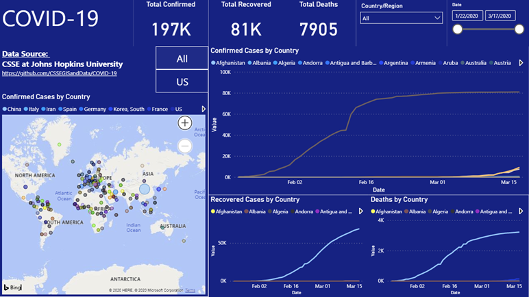
Your final report should look like this now!!! Congratulations!!! You did it!
Power BI Service
If you have a Power BI Pro license you can use the Publish button at the top right to publish to the Power BI Service to share your report to your co-workers, your friends and even the world! You also can setup an automatic refresh of the data to in the service and a whole lot more. More info about the Power BI service is here – https://docs.microsoft.com/en-us/power-bi/service-get-started.
Conclusion
I hoped you enjoyed learning how to user Power BI and how to build your own report for the Novel Coronavirus (COVID-19). If you want to learn more about Power BI check out the official Power BI documentation – https://docs.microsoft.com/en-us/power-bi/. Also, follow Adam and Patrick on the Guy in a Cube YouTube Channel – https://www.youtube.com/channel/UCFp1vaKzpfvoGai0vE5VJ0w. It is the ultimate source of Power BI knowledge.
I have posted a Power BI file that should look exactly like the one you just built if you followed my instructions! You can follow me on Twitter @STATCowboy, connect up with me on LinkedIn at https://www.linkedin.com/in/jameyj/.
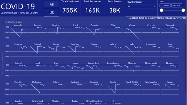
Finally, please be safe during this global pandemic. Wash your hands. Keep safe social distance and limit your interactions with groups until the curve is flat! (You can see in the report you just built that it isn’t flat for the rest of the world!
Guidance from CDC – https://www.cdc.gov/coronavirus/2019-ncov/index.html
Code
GitHub Repo for Power BI Coronavirus Report Tutorial – https://github.com/STATCowboy/Power-BI-Coronavirus-Report-Tutorial


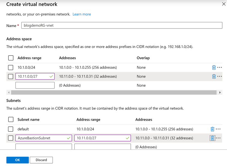
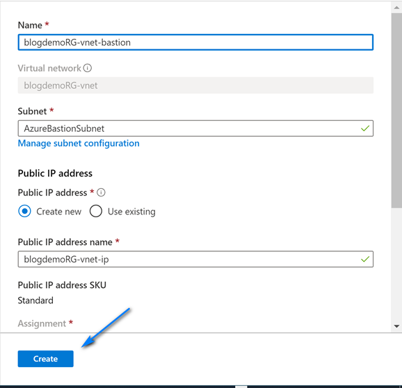
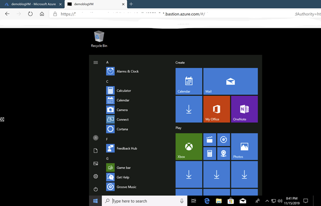
 On the Create virtual network screen leave the default name and fill out the information like below (you can choose you own ranges but make sure to have one with mask 24 for RDP/HTTP and one with mask 27 for Azure Bastion) for the Address spaces and Subnets. Note we create two address spaces and subnets. One is the default with mask 24 for use with RDP and the other is with mask 27 used for Azure Bastion. The name of the Azure Bastion subnet must be AzureBastionSubnet. Click “OK” when done filling out the addresses.